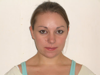
This is an low quality version of our groups final animation
Friday, 12 December 2008
Week Twelve
On Monday of this week we finished adding the last details of our rooms and adjusting timings and music before creating a final render. We also merged our scenes and characters working together throughout the creation of the entire animation process therefore the merge of scenes were made easier due to the fact we used the dimensions and proportions as well as maintaining the scaling and style of our work. Time was spent arranging lighting and camera views, changing movements from static to animated jumping in both our characters, animating the playroom so the toys interacted with Jack as opposed to other characters and creating dry ice effects and falling white flakes in Thomas’ band scene.
This rendering process took hours as we rendered our scenes image by image to produce a high quality finish. Every scene was then edited in Premier Pro and we arranged the scenes to interact with music and surroundings. Throughout the animation the musicality is powerful and accentuates what is seen on screen, the movements of our characters and the exciting journey upon which they embark through their television screen. Without music, or this particular song, a cover of Danny Elfmans’ ‘What’s This?’ by Fall Out Boy, our animation would not be so entertaining nor amusing.
For this project Daniel and I listened carefully to the brief given by Craig Gough. We interpreted what we thought would work, an animated story with a beginning, middle and end which could be easily adapted and memorable for its audience. We also had to decide on a target audience and although the age range of our chosen demographics is quite large; age six through to age twelve, we engage almost all ages due to the uniquely styled rooms and characteristic models we created and the fairly smooth, albeit simple, animations we used throughout. Our video is entertaining and could be used throughout the entire YMCA group and it is not limited to one event or genre.
We presented an almost finished piece to our client, the YMCA staff members on Tuesday and the feedback we received was very positive. Our video made the client laugh and we were informed that our animation was something they would definitely consider using as it was something enjoyable to watch, fun for children and something that could be used by all departments because of the scope it had to adapt for different needs.
To conclude, I believe our small team of two achieved our objectives and those of the brief. We wanted to create a light-hearted, almost magical animation to encourage children from the ages of six through to twelve to visit the YMCA. The client asked for an advertisement they could send out to schools in the area to promote their facilities in such a way that they would be thought of as something other than a ‘grunge’ bar. Our animation portrays the Y Chelmsford as a fun and exciting place for young people to meet, make friends and enjoy themselves whilst doing something they love whether that is playing in a band or just playing. Had we had more time or to re do this project, I would only want to spend more time perfecting the characters movements, shapes and structures as they are not as perfect as I would like them to be.
Tuesday, 2 December 2008
Week Eleven
As the deadline draws near the group decided to start rendering scenes and putting together finishing touches to the living room, the wormhole transition, the Y corridor and each separate room.
The first render was of the living room. After I created the flash video for the YMCA to appear on the television the other group member created the wormhole and put the three scenes together. We rendered Jack and Thomas bored on their sofa as the advert comes on the T.V, the change in their facial expressions as they look hopeful and excited, and finally the brothers being drawn into the YMCA wormhole.
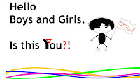
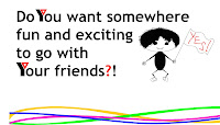

Then the wormhole landed Jack and Thomas in the YMCA’s Y shaped corridor whilst the camera followed them before banking right and viewing the door open into Jacks playroom.
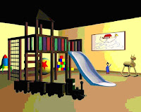
A mural of the Noah’s Ark story was incorporated into the scene in order that the core values of the YMCA were subtly featured as part of the advertisement. The playroom is bright and colourful and entertaining for children up to the age of seven or eight and therefore well suited to our chosen demographic.

The first render was of the living room. After I created the flash video for the YMCA to appear on the television the other group member created the wormhole and put the three scenes together. We rendered Jack and Thomas bored on their sofa as the advert comes on the T.V, the change in their facial expressions as they look hopeful and excited, and finally the brothers being drawn into the YMCA wormhole.


Then the wormhole landed Jack and Thomas in the YMCA’s Y shaped corridor whilst the camera followed them before banking right and viewing the door open into Jacks playroom.

A mural of the Noah’s Ark story was incorporated into the scene in order that the core values of the YMCA were subtly featured as part of the advertisement. The playroom is bright and colourful and entertaining for children up to the age of seven or eight and therefore well suited to our chosen demographic.

Sunday, 30 November 2008
Week Ten
Once the character and its movements were as we desired we next began to model our rooms. As my character is the Jack I was modelling the playroom. We began by deciding on the dimensions of our rooms, how big they should be, what should be included, lighting techniques, textures and floor styles.
We decided to use metre measurements for the rooms and created large open spaces of around twelve by twelve meters with wooden floors, buttercup yellow walls for the playroom and industrial style textures for the School of Rock room.
The first piece of playroom equipment I made was the climbing frame. It was a simple structure of boxes which were manipulated into the various shapes I wanted. The slide was converted to an editable polygon and pulled into shape before adding turbosmooth to create a well formed shape.
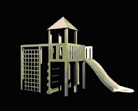
The textures were created using a seamless wood texture import and changing the colouring to create a more entertaining structure for the children to play on. The slide was a two tone texture with the shininess and glossiness adjusted so it reflected in the light and interacted with the surrounding environment.
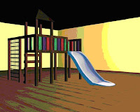
The end result is a wooden climbing frame which looks entertaining for the young children who, hopefully, will be inspired and encouraged to visit the YMCA.
We decided to use metre measurements for the rooms and created large open spaces of around twelve by twelve meters with wooden floors, buttercup yellow walls for the playroom and industrial style textures for the School of Rock room.
The first piece of playroom equipment I made was the climbing frame. It was a simple structure of boxes which were manipulated into the various shapes I wanted. The slide was converted to an editable polygon and pulled into shape before adding turbosmooth to create a well formed shape.

The textures were created using a seamless wood texture import and changing the colouring to create a more entertaining structure for the children to play on. The slide was a two tone texture with the shininess and glossiness adjusted so it reflected in the light and interacted with the surrounding environment.

The end result is a wooden climbing frame which looks entertaining for the young children who, hopefully, will be inspired and encouraged to visit the YMCA.
Friday, 21 November 2008
Week Nine
Once the torso, legs, arms, head and facial features had been built the next stage was to rig the character. To do this the group decided the best method would be to skin and bone each character so we can move their limbs from their joints so all body parts move realistically.

We had several teething problems using this method. Both members of the group have not used this particular tool previously having only used 3DS Max to create static images. The most prominent difficulty was the characters bodies pinched terribly when we tried to sit them down or animate their limbs.

Due to their cartoon appearance, the characters moved in an inhuman fashion and this caused the deformation seen in this pink render of the file. To solve this problem we decided to motion tween the characters from one position to the next.
To do this we had to clone the original upstanding image and position the vertexes to create the shape we wanted. An example of the would be the change between sitting on the sofa with bored expressions, the change to anticipation in their faces and being drawn into the television by the exciting and magical YMCA advert.

This process worked incredibly well and although it was time consuming the end result was almost perfect movement in our characters. There was no pinching like there was when we skinned and boned our characters and the movements flowed smoothly from one to the next.

Monday, 17 November 2008
Week Eight
To divide the work the group split the storyboard in two. One member created the older brother Thomas and the School of Rock themed room whilst I created the younger brother Jack and the playroom for younger children.
First to build the character I scanned in a scaled image I had previously drawn and created a box the size of the torso. I then extended the arms and legs in the correct position and to scale by converting the box to an editable polygon, extruding the faces and positioning the legs slightly apart and the arms in the style of Leonardo Da Vinci’s renowned Vitruvian man. This was done so the character could be skinned and boned to enable him to move freely and mirrored to create an even character shape all over.
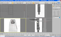
Once I applied the symmetry I created the head for my character. They were not designed to look real; I wanted to create an animation that was loosely based on the characters that star in Pixar animations. Obviously the standards would not be quite the same but the idea was to aim for the same style. As a result I had drawn a young boy with a rather large head and bright orange hair, huge eyes and a small button nose. To create the head I drew a sphere and then collapsed it, manipulating the vertexes until I had built the same potato shaped head in 3D as I had when I drew it in 2D.
First to build the character I scanned in a scaled image I had previously drawn and created a box the size of the torso. I then extended the arms and legs in the correct position and to scale by converting the box to an editable polygon, extruding the faces and positioning the legs slightly apart and the arms in the style of Leonardo Da Vinci’s renowned Vitruvian man. This was done so the character could be skinned and boned to enable him to move freely and mirrored to create an even character shape all over.

Once I applied the symmetry I created the head for my character. They were not designed to look real; I wanted to create an animation that was loosely based on the characters that star in Pixar animations. Obviously the standards would not be quite the same but the idea was to aim for the same style. As a result I had drawn a young boy with a rather large head and bright orange hair, huge eyes and a small button nose. To create the head I drew a sphere and then collapsed it, manipulating the vertexes until I had built the same potato shaped head in 3D as I had when I drew it in 2D.

Saturday, 8 November 2008
Week Seven
Upon arrival at the YMCA Chelmsford, Craig Gough was way laid and the meeting postponed to a later date. In the meantime the storyboard was finalised and the character build began.
Thus far the story began in the family living room with the two brothers side by side on the sofa watching television after school. Two boys were introduced of different ages, the youngest Jack, age 6 and the older brother Thomas, age twelve. The aim for this is the brief given by Craig Gough mentioned that the Y offers a range of activities available to children of all ages. We believed that rather than focus on one particular event we would create an advertisement that would run for several minutes and suited being sent out to primary and the early years of secondary schools to promote the key events and activities provided for young people in the area. Consequently the younger brother, Jack, would be seen having fun in an animated playroom whilst the older brother, Thomas, would be involved in the ‘School of Rock’ night which is one of the most popular events.
Thus far the story began in the family living room with the two brothers side by side on the sofa watching television after school. Two boys were introduced of different ages, the youngest Jack, age 6 and the older brother Thomas, age twelve. The aim for this is the brief given by Craig Gough mentioned that the Y offers a range of activities available to children of all ages. We believed that rather than focus on one particular event we would create an advertisement that would run for several minutes and suited being sent out to primary and the early years of secondary schools to promote the key events and activities provided for young people in the area. Consequently the younger brother, Jack, would be seen having fun in an animated playroom whilst the older brother, Thomas, would be involved in the ‘School of Rock’ night which is one of the most popular events.
To set the scene and introduce the YMCA, the camera was to be instructed to pan around the room and the viewpoint change to see the television behind the brothers’ heads. An advert would play on the screen and ask the boys and girls at home if they were bored.
Once asked if bored the camera will pan round to a close up of the brothers faces changing from being bored to an anticipated excitement.
The YMCA advert will then draw the boys into the television set and transport them via a wormhole created in 3DS Max to the Y. Where they will land in a Y shaped corridor and run down together. At the fork Jack will go to the right fork and Thomas to the left, the camera will bank and follow Jack to the playroom.
Here Jack will be surrounded by toys including a life-size soldier, a climbing frame and slide, a bouncing Pixar style ball, rocking horse and train set, amongst others. After he runs excitedly around the room and advertises to primary school children how fun it would be to go after school the camera will flip back to the corridor and follow Thomas into his room.
School of Rock is the best known and most popular night at the YMCA however Craig Gough mentioned that numbers are slowly dwindling and this is the reason we chose to include this particular night. The band will perform a rock version of ‘What’s This?’ from the animated film by Tim Burton; The Nightmare before Christmas. The song choice came about because the group is constantly inspired by Danny Elfman compositions and Tim Burtons mix of the real and surreal.
Another quality included in the advertisement is its ability it holds to be flexible, rooms can be added onto and running off of the corridor to promote other activities and events, the main rooms can be adjusted so they feature the latest night or club the Y wishes to stage.
Monday, 3 November 2008
Week Six
The early part of this week is dedicated to creating the finishing touches for the 3D Face prototype due to be handed in on Friday and picking up from where we left off with the continuation of the Young Mans Christian Association project.
The 3D prototype portrait has developed with a relative amount of success. Clearly it is a female character with a full face, large almond shaped brown eyes, an upturned nose and a shapely mouth. Although it is not a true representation of the model it is based on, the features it defines are incredibly similar to those of the original photograph.
Hair was the final addition to the character and due to time constraints it could not be built. Instead the hair and fur tool from the 3DS Max package was used to create one hundred and fifty thousand two inch long hairs to cover the scalp with out bald patches! The hair was coloured dark brown at the tips and light brown at the ends and using the comb tool was pulled out to create a wavy, spiked ‘do which looked very eighties but allowed the viewer a glimpse of how longer, flowing hair would look upon the model.
With the finishing touches complete the assignment was ready to be handed in; snapshot images as well as the 3DS Max file were uploaded to a disc for grading by the course leader.
Previously in week three after receiving feedback from the course leader the decision was made to draw full length front and side views of each character being made for the YMCA promotional advertisement. Finally in week six this was able to be done, the sketches were recreated on A3 paper and coloured using a scheme which reflects the fun and age ranges of the projects available at the YMCA as well as those which will appeal to the target audience. Namely these are primary colours; red, yellow and blue. These sketches will be presented to Craig Gough in week seven when the group is due to meet him.
Week Five
Having almost completed the facial features in the previous week, this week the focus is to build the back of the head, create the neck and add textures such as skin, eyes and if possible, a full head of hair!
Continuing the build of the head involved drawing yet more trace lines on the original side view photograph to use as a guide. The next step was to create a sphere and align this with the face, shaping it where necessary to create a basis for the head. From here, the quad lines of the face and the traced guidelines were used to align the sphere and build back from the face and down to the neck area. As with shaping the face, each quad had to be manipulated and aligned, then the image rendered to see the effect before readjusting to create as smooth a shape as possible.
Building the neck back from the chin was definitely the most technically difficult part of the tutorial for several reasons. The main reason being it was hard to decipher which angle to create the underside of the chin and then as the build of it commenced how to shape it so that it was not full of lines and dips and creases but a smooth, realistic surface.
A lot of time was dedicated to smoothing the contours and surface of the back of the head and neck; it was incredibly difficult to get the alignment of the quads right. As a result, for the majority the head and neck areas are smooth and bump free but small patches are uneven in their texture and their shape is not a true representation of the 2D image.
Texturing the face was fairly simple a plain skin colour was used from the palette provided by 3DS Max. For the eye, two circles were drawn in Adobe Photoshop, the inner made the pupil and therefore was a glossy black colour, and the outer circle made the iris and was a hazel brown colour. This was then imported as a texture into 3DS Max, the glossiness adjusted so the eye shone and the eyes were adjusted so the pupil and iris were in the centre and round to create as true to life an appearance as possible.
Week Four
Creating a 3D face using 3DS Max is a unique experience for a novice to the programme. To solve the quad line problem of the previous week, simple changes had to be made in the settings of how the package uses and displays the photograph; basically the bitmap needed to be matched between the jpeg image and 3DS Max to allow the trace lines visibility.

Using the line tool and using vertexes quad lines were drawn over the face to create a foundation for the work to be carried out in the next stages.
Once the quad lines were complete it was necessary to change the users view to the left side. Using the profile as a positioning guide, the quad line points were pulled to align with the contours of the forehead, eyebrow, eye socket, nose, mouth and chin. The combination of these two steps allowed for manipulation of the remaining quads to create eyes, nose, cheeks, lips and chin.
To create a smooth, shapely face without wrinkles, creases or unrealistic dips was a timely process and involved constant realignment of quads with test renders to view the effect each changed shape and line had on the overall appearance of the face.
The eye socket was built using editable polygons; the eye contours were manipulated around the eyeball and shaped to resemble the same curves of an authentic eye area.
The nose was built in much the same way; the original quads outlining the face were pulled into a nose shape similar to my own which involved pulling it up slightly at the tip of the nose and maintaining a straight strong line through the middle.
For the lips editable polygons were used once again to create the fullness and shape. Instead of being flush to the face the mouth is slightly extruded and cuts almost in half in the centre of the top lip as mine do. The bottom lip is rounded and full, and both are bright red in colour both to show off their shape and because the original photograph used to create this 3D self portrait portrays a bold red lip colour.
Monday, 20 October 2008
Virtual Environments Week Three
This week the project can be broken down into two parts; the first is the creation of a 3D face prototype and the second is taking the next steps for the YMCA assignment. Having pitched the original YMCA idea to the course leader and received positive feedback and constructive criticisms the intention is to draw full scale front, back and side views of each young male characters. The aim for doing this is so there are defined shapes and sizes to work with; a two dimensional template for the three dimensional characters. We also decided to play with textures that could be worked with in Studios Max; whether to use block colours or create such materials as denim, cotton and leather. These options will be decided later in the final stages of the project as the actual build is more important to focus on at this stage. The meeting with Craig Gough is yet to be arranged but the possibilities are for week five or six.
The second part of the project for this week is the creation of a prototype face. The preparation of which requires a front and side view photographed self portrait.
The second part of the project for this week is the creation of a prototype face. The preparation of which requires a front and side view photographed self portrait.
Once taken these photos had to be loaded into Adobe Photoshop and then the face must be adjusted so the features are both the same size and level between the two different views. In order to create a three dimensional face in 3D Studios Max preparation can be done to simplify the process in Photoshop. The basic idea here is to draw in the structure lines of the face, tracing the shapes and contours around the eyes, mouth, cheekbones and chin providing to scale guidelines to trace in 3DS Max. To do so, an online tutorial found at
provided step by step instructions directing where the lines need to be drawn and how to achieve the best results. Once the feature lines have been drawn on a separate layer to the photograph of the front view using a blue paintbrush a new layer must be created. Then the next step is to trace the blue feature lines and extend them to outline each shape of the face and draw in quad lines which will be used to construct the model of the face when transferred into the 3D package.
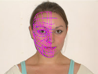
The tutorial took a matter of hours to complete to be at a standard that was high enough for this level of work. The image was imported into 3D Studios Max and this was where some teething problems were encountered. The resolution of the lines drawn in Photoshop that shown in 3Ds Max are not of a high quality and therefore the quad lines are not visible enough to be traced as intended.
Virtual Environments Week Two
Mondays lecture was replaced with an initial briefing of and visit to the Young Mans Christian Association Chelmsford. The talk was hosted by Craig Gough who informed the group of his expectations regarding the advertisement as well as key groups and event nights held at the YMCA which he wishes to promote to a wide spectrum audience.
We could not view the premises as the group was too large and therefore Daniel and I emailed Mr. Gough (craig.gough@chelmsfordymca.co.uk) in order to arrange a meeting at a later stage to formally visit and observe the various functions of each room as well as which groups make use of the facilities.
As a starting point to meet the expectations of Mr. Gough and our brief we designed an idea cloud of various solutions to the problem. The favoured response would be to create an advert which appealed to a wide age range to incorporate the many amenities available at the YMCA. Mr. Gough mentioned he would like an animation which could be posted directly to schools to advertise the Charity and the variety of activities, groups and support they offer for all ages.
The idea cloud encouraged the idea of a first proposition to solve the problem. A grayscale home environment with two brothers; one young and energetic, the other older with the need of a creative outlet, bored at home and watching dull daytime television. The screen pans round to show the television screen which suddenly becomes colourful, bright and fun lighting the room and advertising the YMCA.
The advertisement asks its audience [the two brothers] if they are bored and invites them to join in the fun at the YMCA Chelmsford. The pair of boys are taken in by the advertisement and find themselves at the charity premises. The camera follows them as they dash excitedly from room to room [highlighting the nursery, after schools club, battle of the band, open mic night and youth sports club] before they go their separate ways to make new friends and participate in the sports club and open mic night.
The aim here is to reach a wide audience of various ages, interests and needs and therefore it is believed that two main characters with opposing interests and a fairly large age gap is the best solution. The first excited look around the YMCA allows insight into the large variety of activities, groups and support available as well as the services provided by the charity.
Monday, 29 September 2008
The Brief: Initial Thoughts Week One
The Young Mans Christian Association is a charity based in Chelmsford town centre that provides support and entertainment to children of all ages, three months right through to sixteen years old. The YMCA has been running since 1844 when it was formed by George Williams in the churchyard at St. Pauls, London. This lengthy history should not be lost due to lack of awareness or a certain stigma that currently holds at the Chelmsford division.
The brief proposes we create an advertisement that will be posted to primary and secondary schools throughout the Chelmsford catchment area and viewed during assembly times. It must, therefore, be entertaining and accessible to all audiences from ages nine to sixteen. The brief must raise awareness of the variety of programs available at the YMCA and create a new image for the charity that encourages a more positive, cheerful and welcoming experience.
The modelling technique in 3D Studio Max is almost a foreign concept to me. Previously the only 3D modelling undertaken was the creation of a hidden enchanted room inside an old pub; which clearly uses very different modelling techniques to the formation of an organic creature such as the human form.
However, although this is going to be an extremely challenging project it also will allow a broadening of my current working knowledge of 3D Studios Max that will be hugely beneficial.
The first steps tutorial (cg-india.com\tutorials\3dsmax_tutorials_organic_modeling.html) giving guidance on how to make a head in 3D Max was incredibly useful. The first steps were to take side and front view photographs of ourselves and load them into Adobe Photoshop. Following the tutorial was a fairly simple exercise as the instructions were clear and the benefit to it being an online tutorial meant it could be paused and rewound as many times as necessary whilst the photographs were being manipulated in the first instance.
Subscribe to:
Comments (Atom)


